
Alexander & Sons Blog
How to Pick the Right Paver Color and Style for Your Home
Choosing pavers isn’t just a practical decision — it’s a design decision that you’ll live with for 20+ years. Get it right and your driveway or patio looks like it was always supposed to be there. Get it wrong and even a technically perfect installation can feel off.
The good news: there’s a clear process for making this decision well, and it’s not as complicated as it might seem when you’re staring at a sample board with 40 options.
Start With Your Home, Not the Samples
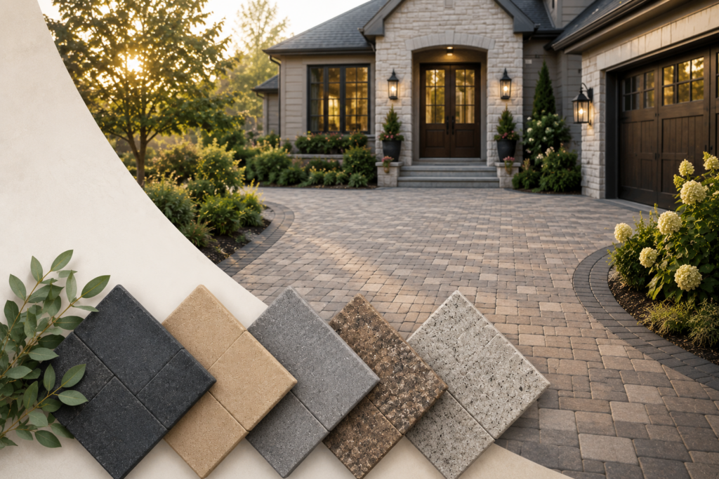
Before you look at a single paver, look at your house. The color of your exterior — siding, stucco, brick, or stone — is your anchor point. Your pavers should complement it, not compete with it.
Warm-toned homes (tans, creams, warm grays, red brick) tend to look best with pavers in the same warm family — buffs, sandstones, browns, and terra cottas. Cool-toned homes (whites, cool grays, blues, darker stucco) pair well with pavers that have gray, slate, or charcoal undertones.
The roof matters too. If you have a dark charcoal roof, you have more flexibility. A warm clay tile roof points you toward warmer tones throughout.
Understand How Color Reads in Different Light
This is where a lot of homeowners get tripped up. A paver that looks one way in a showroom under artificial light can look noticeably different in your yard in direct afternoon sun, in shade, or after rain. A few things to know:
- Lighter pavers show more contrast in sunlight and can feel bright or washed out in very sunny exposures
- Darker pavers absorb heat and show less dirt day-to-day, but can show dust and light debris more readily
- Multi-tonal or blended pavers — those with variation in each piece — tend to be the most forgiving and natural-looking
- Wet pavers look different than dry ones; ask to see samples in both conditions before making a final decision
Match the Pattern to the Purpose
The pattern you choose affects how the space feels as much as the color does.
Running Bond — the classic brick pattern with offset rows. Clean and straightforward. Works well for driveways and walkways where you want a structured, traditional look.
Herringbone — a 45- or 90-degree interlocking pattern that’s exceptionally strong underfoot and under vehicle weight. A popular choice for driveways. More dynamic and intentional-looking than running bond.
Basketweave — a classic pattern that works well for patios and courtyard-style spaces. Gives a slightly more formal, old-world feel that pairs beautifully with natural stone or tumbled pavers.
Random / Ashlar — irregular or varying-size layouts that mimic natural stone. Great for patios, pool decks, and spaces where you want an organic, relaxed feel. Requires more skill to install well, but the result is striking.

See It In Person Before You Commit
This is the one thing we tell every client: samples look different at scale. A small tile on a board is not the same as 600 square feet of that material in your yard. Whenever possible, see larger samples or completed projects in the material you’re considering.
That’s exactly why we have our showroom in Campbell. You can see full-size displays, hold the actual materials, and compare options side by side. We don’t sell you on anything — we help you figure out what’s right for your home.
Come visit us at 1554 La Pradera Dr, Campbell — open Monday through Friday, 9am to 4pm. Or call (408) 515-2525 to schedule a free estimate and we’ll bring samples to your home.
Welcome to the
Alexander & Sons Blog
From patios to driveways, your source for expert concrete and hardscape advice in Campbell, Los Gatos, Palo Alto, and beyond.